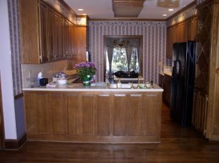
I really love this kitchen. It has a ton of counter space and, although you cannot see it in this picture, a great eating area that has windows on three sides and looks out over the wooded backyard. This kitchen was a big selling point with me. Oh, and the cabinets go to the ceiling so I don't have that dust catching area above them.
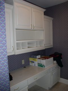
 I also love this office area/laundry room/mud room off the kitchen. This built in desk will be great for a computer that I can check my email on during the day.
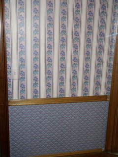
 Now, here is a close up of the wallpaper in the kitchen. First let me say, I am sure it is beautiful wallpaper. I am sure there are many people out there who love it, or the wallpaper company wouldn't have made it. It just is not my style.
 Here is the dining room chandeliere. This fixture will be replaced as soon as the painting is done. No need to have a new one in there while we are painting.
 This picture actually does not do it justice. You cannot see all the spikey branches. Also, it has been painted gold. Gold is not its original color. I am not a gold fixture person, so there are a lot of fixtures in the house that need to be changed including all the door knobs, cabinet pulls, faucets, and shower heads.
Here is a close up of the wallpaper in the dining room.
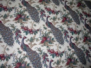 These peacocks have a lot of detail on them that you cannot see in this small picture. I cannot imagine having turkey in a room with these on the wall. However, I am beginning to see how they could be used in a quilt... Too bad there is no peacock fabric on the drapes...
One last room--the powder room. This paper is what is on the walls:
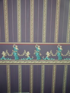 And here is the ceiling...
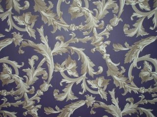 I just don't know about having people on the wall in the powder room. It seems like it would ruin any sense of privacy.
 So, as you can see, we have a lot of work to do. However, I am so excited about this house. We have met some neighbors and they are great. It is going to be a great move for us.
8 comments:
Woo, Jules. No explanation or disclaimers needed; a picture is worth a thousand words. Girl, you've got your work cut out for you! But what a happy job it is. It will be wonderful when your artist's touch emerges.
Moving is a real hassle, but it can be an exciting time too.
If I were in your place the paper would go too. Like you said, it is just not me.
CONGRATS, Jules!!! I"m SO happy for you! But...gota ask...are YOU and dh doing the stripping of the wallpaper? If so....*really* STRONGLY consider paying someone to do it. I spent a good portion of last year ripping off layers of wallpaper in my home (all of it's now GONE...YIPPEE!) and let me tell ya...it is NOT a fun job. Infact...it hit the #1 spot of honest-to-goodness-hate-to-do remodeling jobs in my book. Really....let someone else deal with it. It's money VERY well spent. ;o)
Too bad those peacocks aren't on fabric...Love your mud/laundry/computer room. That looks like it will be a popular spot.
oooh Jules, I LOVE before pictures!! The cabinetry in the new house is really nice, especially in your computer room. Looks like the house has great bones. I agree--the wallpaper has to go.
You will have a lot of fun putting your own stamp on this house, but I don't envy you removing all that wallpaper.
Can we see some pictures of the outside of the house???
I guess I will have to be the maverick here but I actually like some of the wallpaper. Is there any way you can work it in without removing all of it? In the bathroom, how about covering the border but leaving the stripe?
I love bird stuff--you could use it as the backdrop for a bird inspired room with some other large bird figurines and beautiful linen drapes with some large birds embroidered around the bottom hem (or appliqued on). I also like lots of leaves with birds.
You can always minimize the purple with some other colors--add in some blues and greens; try some golds/yellows. I very large wallhanging with some related bird motifs would be nice to cover a large section of the paper. Maybe the other walls could be textured with some paint to give a natural feeling (or even some grasscloth).
I would live with it for awhile before getting all wallpaper stripping crazy. You may find it an interesting challenge to get other decorating items to fit the theme.
Looked at your pictures again and it looks like the wallpaper was professionally done.
What I dislike more than the wallpaer is wooden cabinets on wooden floors. To me it is just too much wood for one room.
When I bought my Houston house (after my divorce) the wood in the house was very 1980s tired. It also had wood paneling in the large living/family room. I knew I was going to lay hardwood floors but all the library styled paneling was too expensive to remove. I had all the cabinets in the kitchen, the walls in the great room, the bookcases and the fireplace professionally painted. It was so dramatic of a change the house looked like a different house. Then, I had the foyer tile removed, new tile installed and hardword floors installed in the dining and great room. It was fabulous. I used pale shades of blue that looked grey at times. It was just so much fun doing the design work I had considered doing all the painting myself but I had a painting crew in for 2 weeks & that ended up being money well spent. They also textured over the old 1980s wallpaper and painted the walls in the kitchen. It was a great job! (Then, I met Wes and moved out. My son enjoys it now!)
Post a Comment